
According to Spotify’s own ethos on understanding recommendations,
They focus on “no two users being the same” and a slow build of curating your own personal music listening experience. Spotify calls this your “TASTE PROFILE”.
They focus on “no two users being the same” and a slow build of curating your own personal music listening experience. Spotify calls this your “TASTE PROFILE”.
But Spotify has so much going on. Some might say, too much.
How can we condense this discoverability
into one collaborative concept?
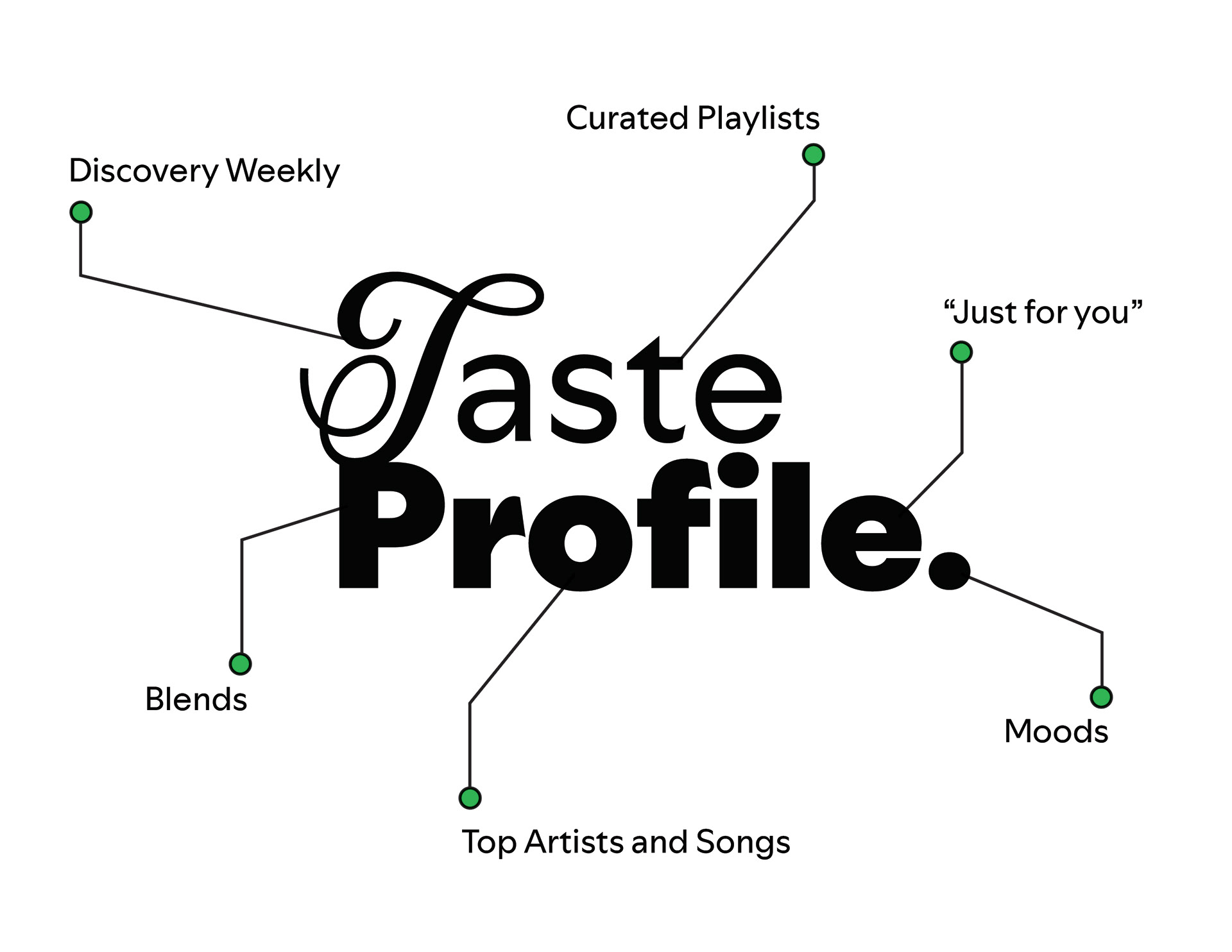
Introducing, Taste Profile.
PROCESS:
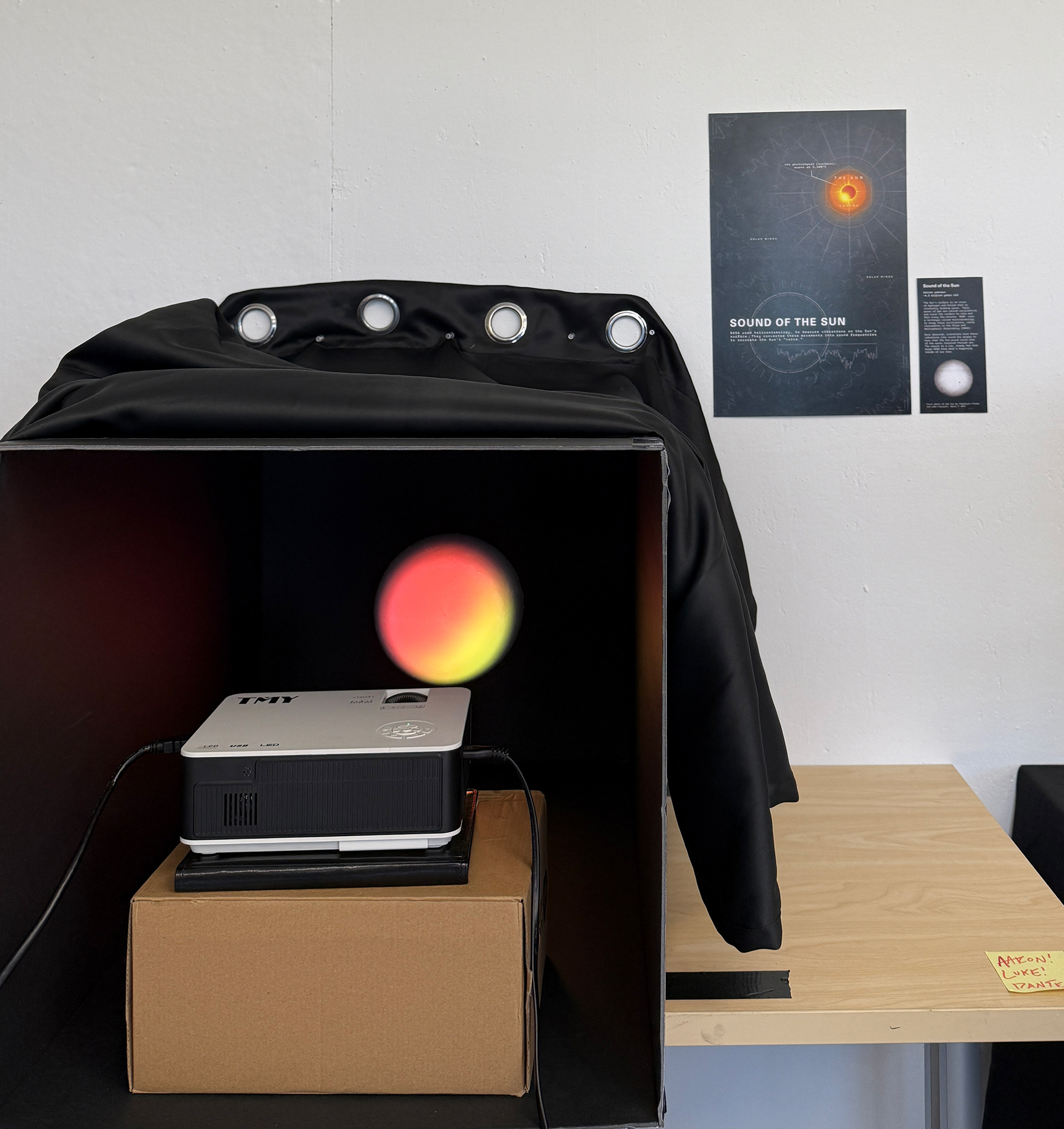
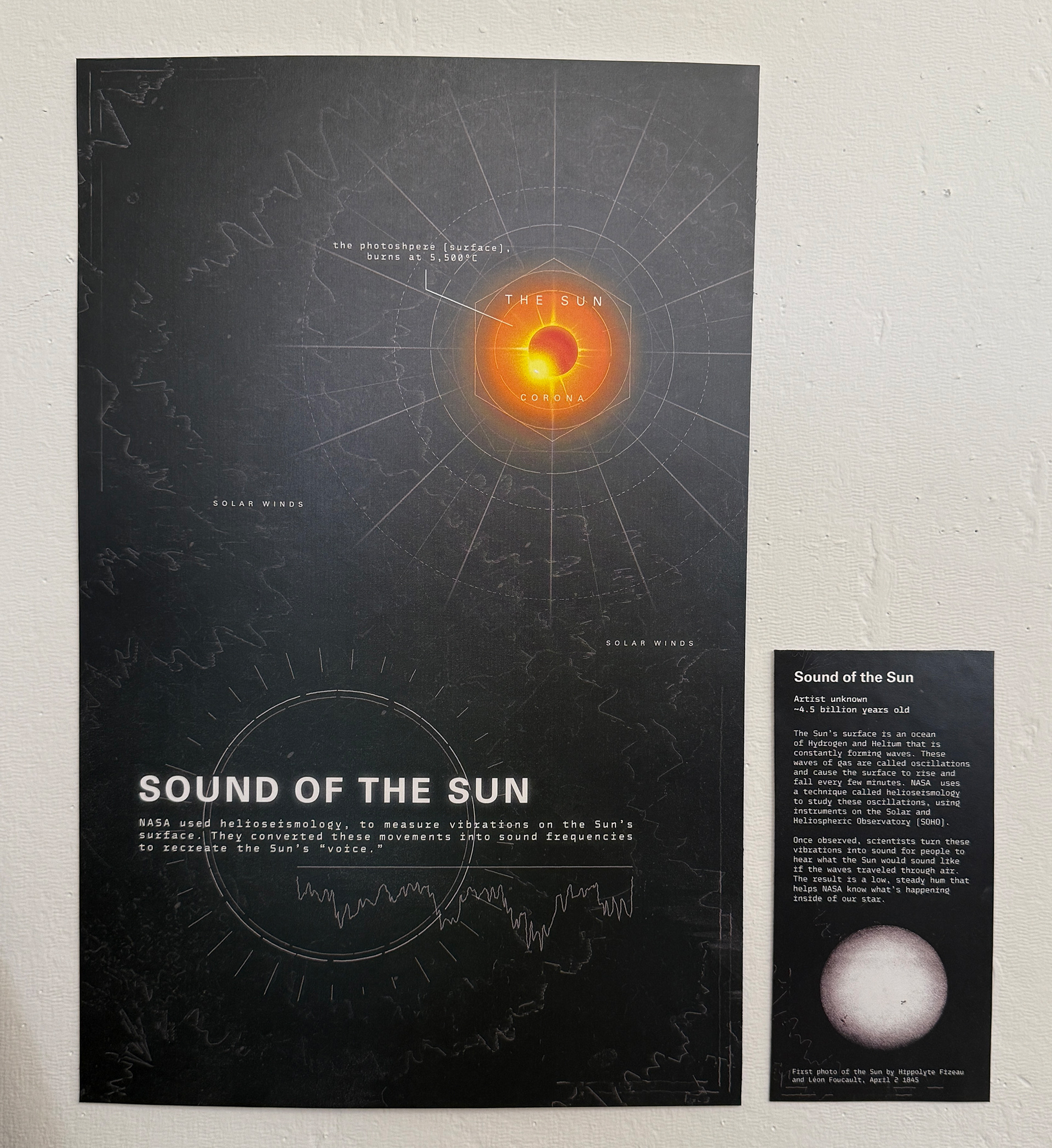
SOUND MUSEUM:
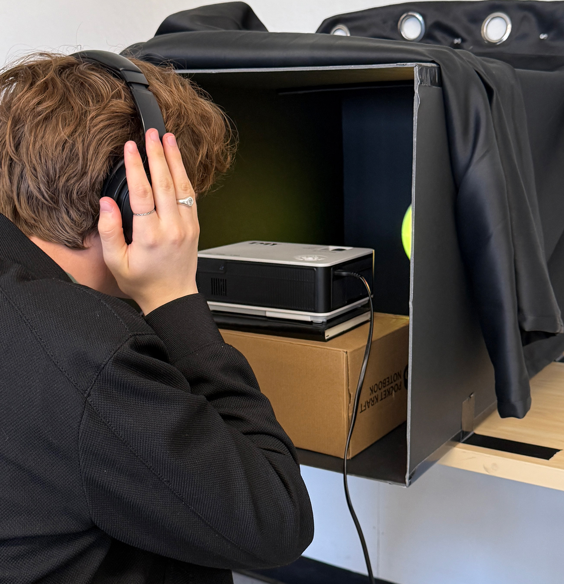
At the beginning of the exploration, we were introduced to a one-week assignment where we divided into groups to work together on research, design, and presentation of a sound-based object for the "Sound Museum". My group consisted of me, Luke Kinney, and Dante Bianchino.
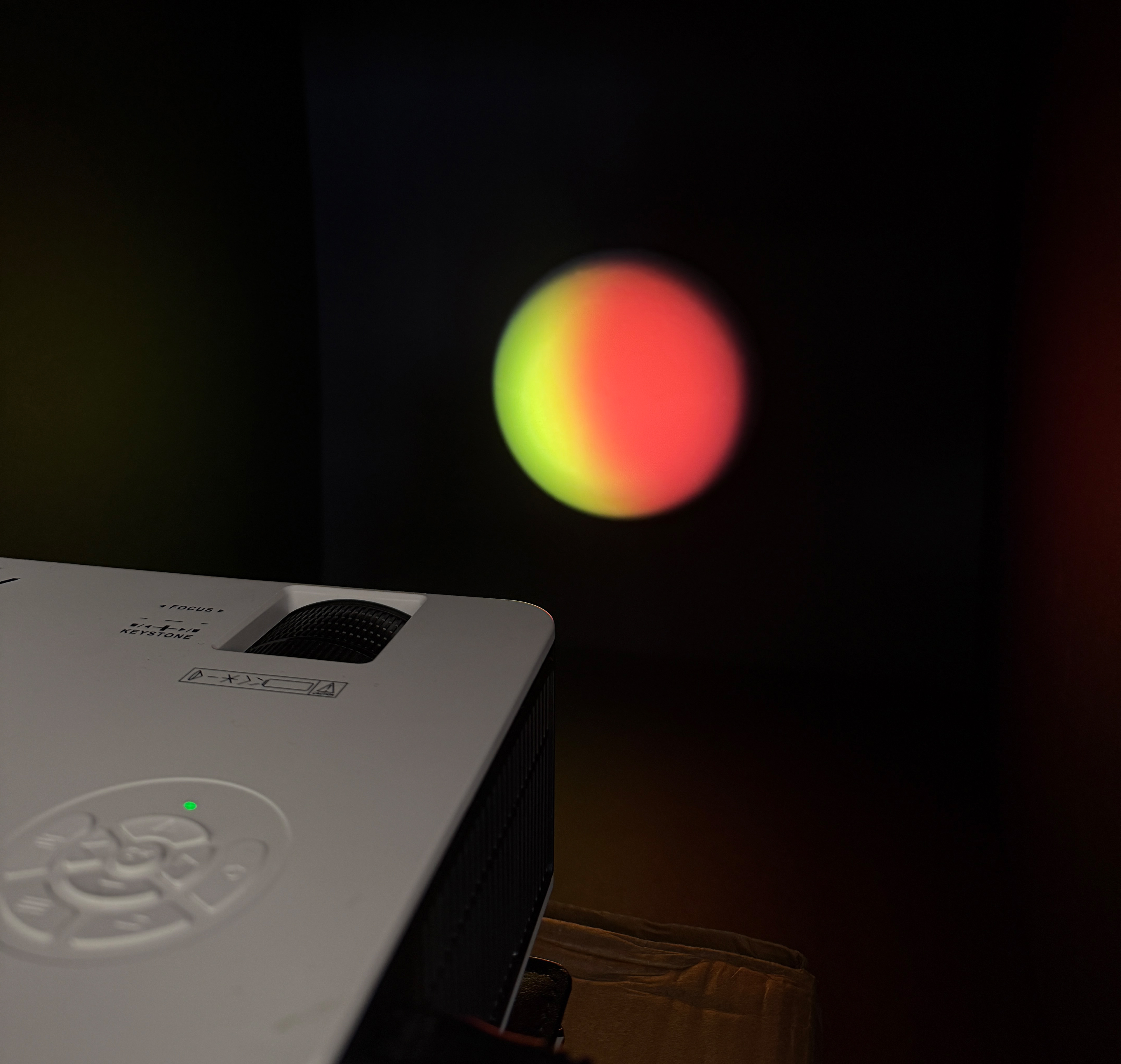
We based our installation on the frequency produced by the Sun, emulated digitally through noise cancelling headphones. The calming frequency was paired with an animated projection of the Sun extruding off the back wall of our installation box, an informational poster, as well as a museum object label.
RESEARCH:
We stayed in the same groups, and conducted research a one sound-based phone application. We chose our research category to be "Discovery and Suggestions", and what better app to focus on than Spotify.
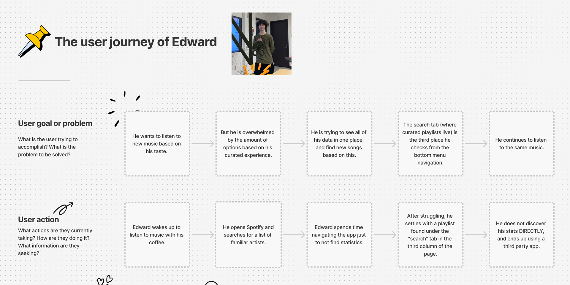
We concluded that Spotify has a solid base for music discovery, but the experience can sometimes feel stale, with the interface making it hard to know where to look for new songs. By highlighting discovery more clearly and pushing its algorithm further, Spotify could encourage users to move beyond familiar tracks and grow their tastes.
PERSONAS:
The presentation last week was deemed extremely useful to furthering my concept, as my group chose to focus on Spotify as our app to research. I already had a good grasp of all of Spotify’s curated experiences for the user. Next was finding out how to condense it. When I first heard “Taste Profile” during research, I instantly thought: “huh, that should really be used as a marketing tool for them. It has a ring to it.”
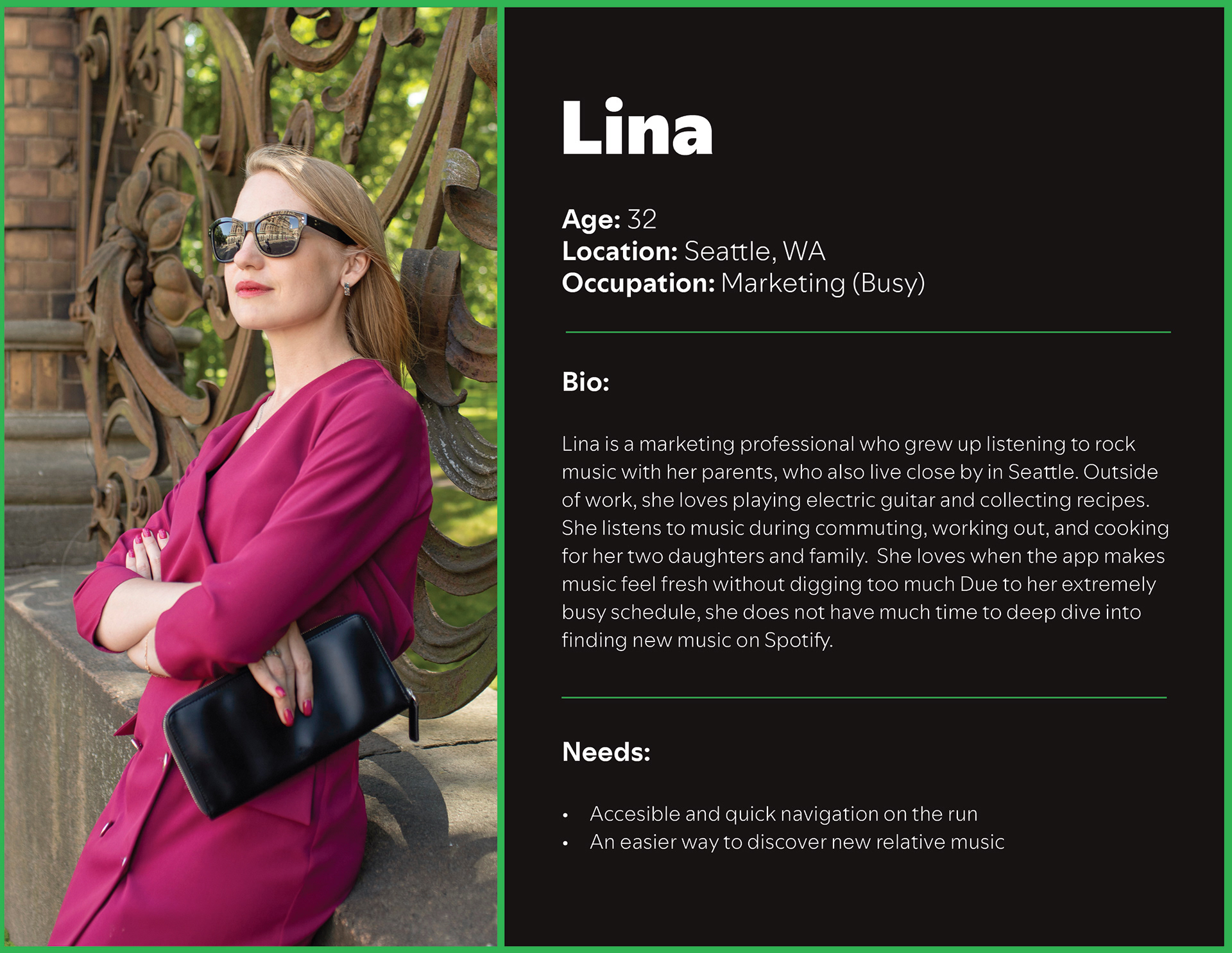
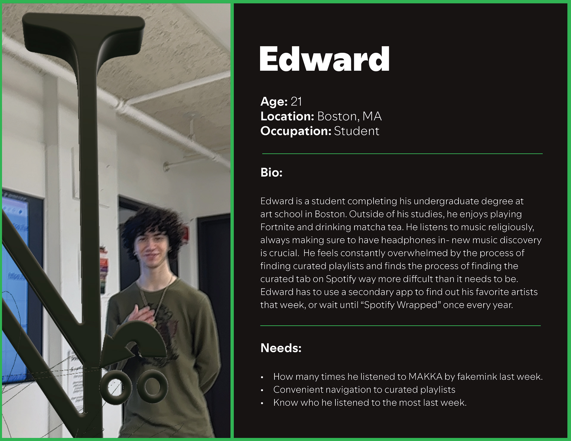
I started off by first creating two personas of users that would genuinely benefit from this feature being added. I wanted them to juxtapose each other as well, proving that the function can solve two very varying issues. One being a middle aged woman with children, and one being a music obsessed college student. I chose these two because one values accessibility, and the other values statistics (but also a little bit of convenience).
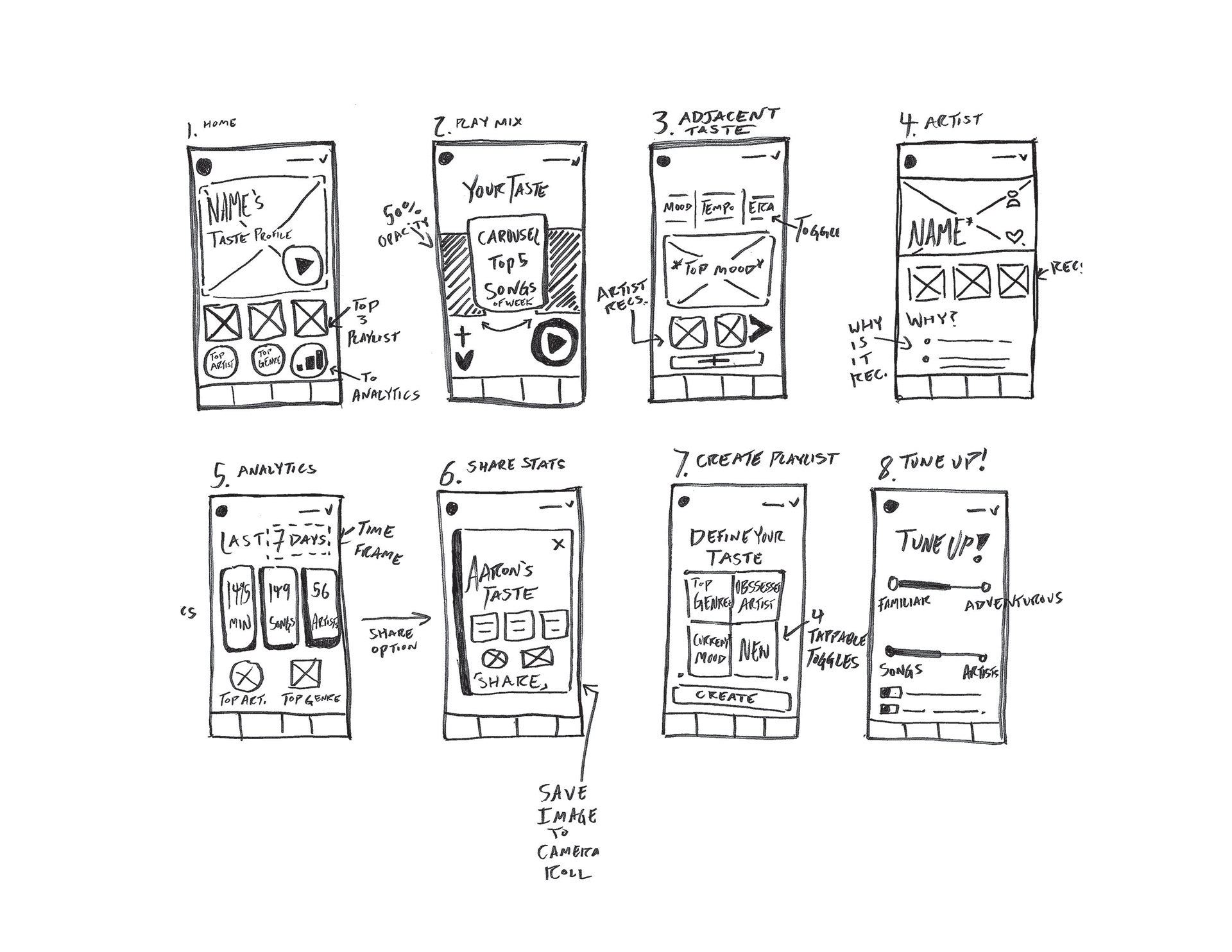
SKETCHING:
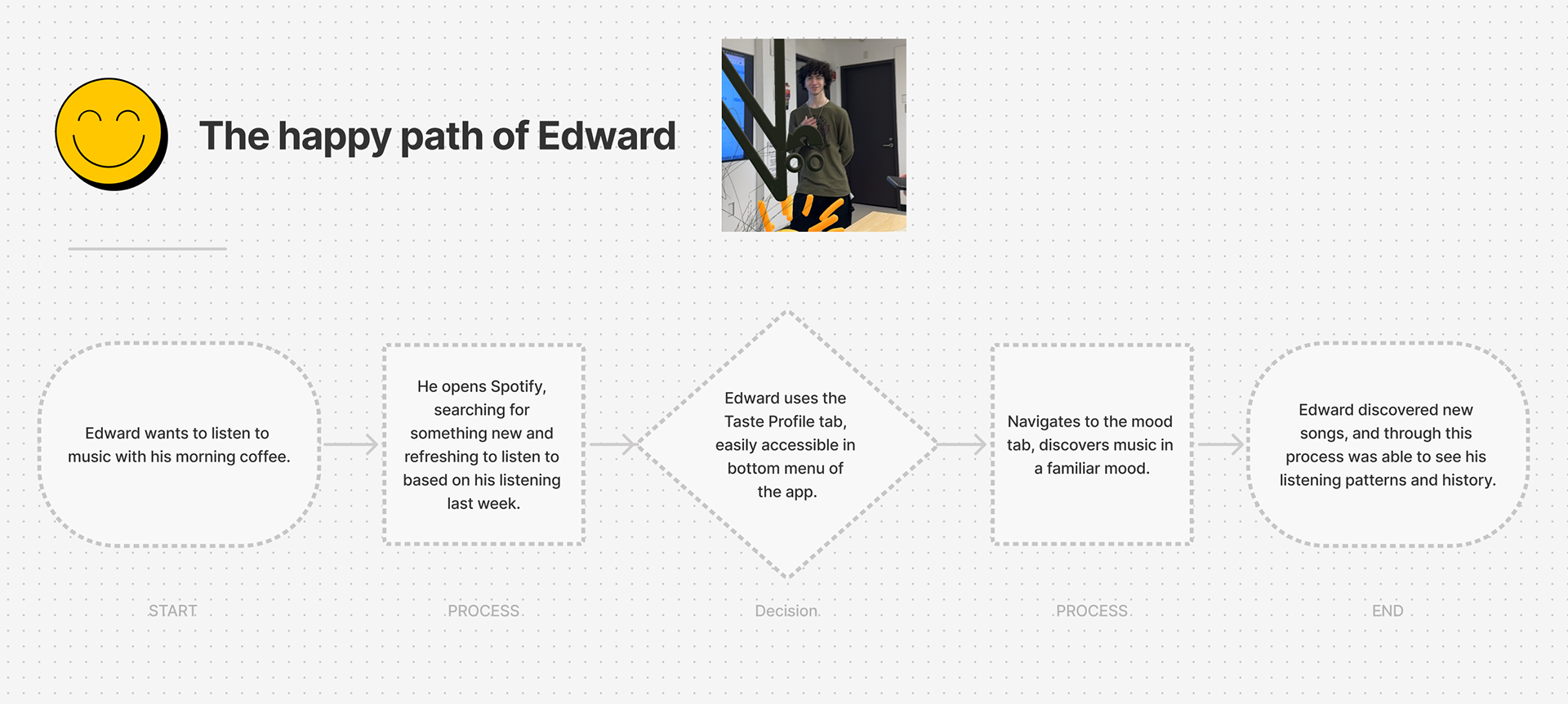
I followed Persona #2 of Edward when developing mid-fidelity wireframes. I deeply considered the thumb zone, and an accessible look that was deemed useful, but also simple visually. At first, I was worried I was going to only need around 4 wireframes. In the end, I created 8 total. Once I got to work on the wireframes by hand, it was easier to contextualize the path in which the pages go, and wireframes that could fit in between the experience.
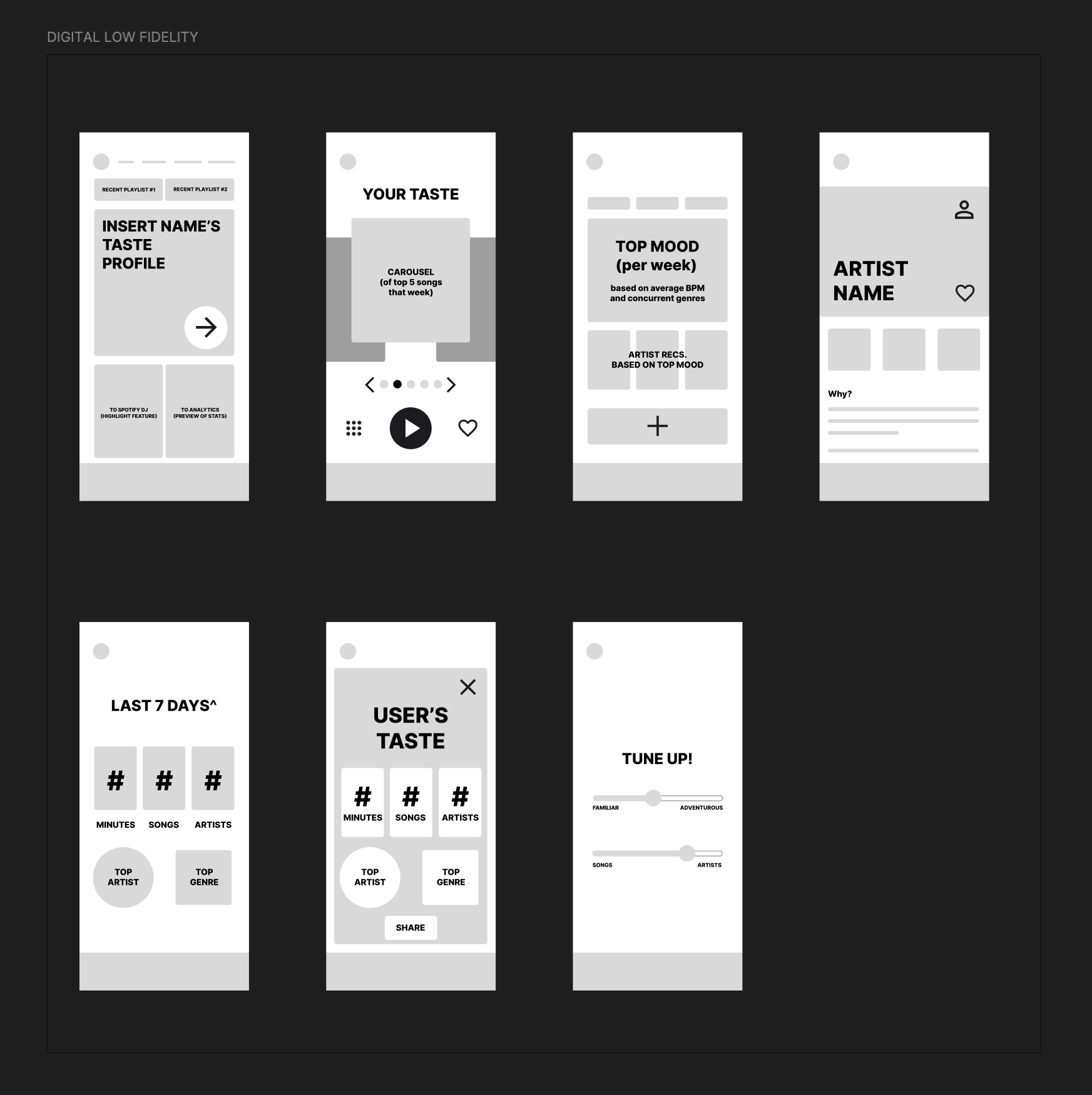
WIREFRAMING:
Developed mid-fidelity digital wireframes so I would have a clean blueprint of where I want functions to go/app placements. This was deemed the most useful part of this week, as using these blueprints as reference and direct screenshots from Spotify allowed for quick cross-references between the already existing UI and the one I am creating.
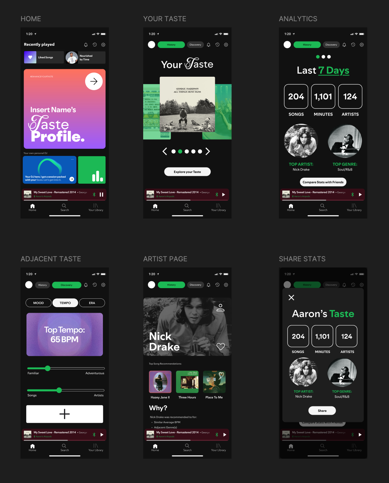
I took creative liberties with the actual letterforms for the “Taste Profile” text, adding a script letter to pair with the “Spotify Mix” typeface. This worked the visual media even further into the reasoning for my enhancement- a flashy letterform that your eyes (should) instantly jump to on the page.
At this stage, I feel like I made the most changes to my concept. I was able to decide that I did not need one of the 8 screens, as it would not be functional to show in the user’s story of the app. Luckily, this realization was made during the mid-fidelity, before I got my hands dirty with the complex high-fidelity wireframes.
DIGITAL PROTOTYPE:
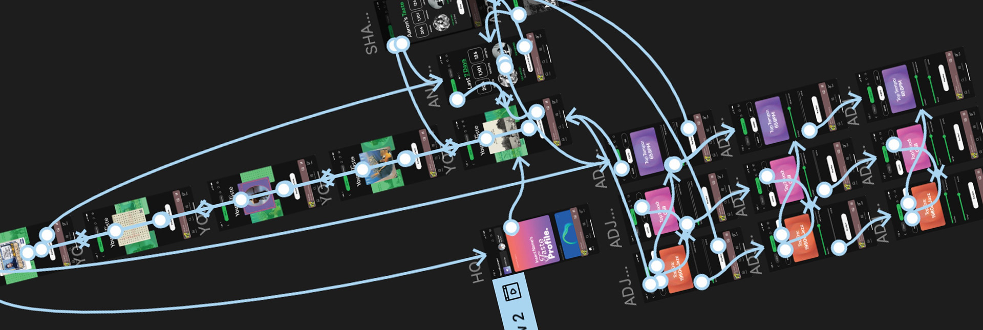
It then came time to develop prototyping to test the workflow of
the screens. This included click asset -> change page functions. I wanted to focus on enhancing the workflow through prototyping in my wireframes. I added an actual functioning carousel animation when viewing your top 5 songs for that week. I used the “smart animation” feature in Figma to achieve a smooth transition between screens. I also used this feature for the two slider animations in the “Discovery” tab. I first discovered this new feature at one of the FigJam events last year.
the screens. This included click asset -> change page functions. I wanted to focus on enhancing the workflow through prototyping in my wireframes. I added an actual functioning carousel animation when viewing your top 5 songs for that week. I used the “smart animation” feature in Figma to achieve a smooth transition between screens. I also used this feature for the two slider animations in the “Discovery” tab. I first discovered this new feature at one of the FigJam events last year.
MARKETING:
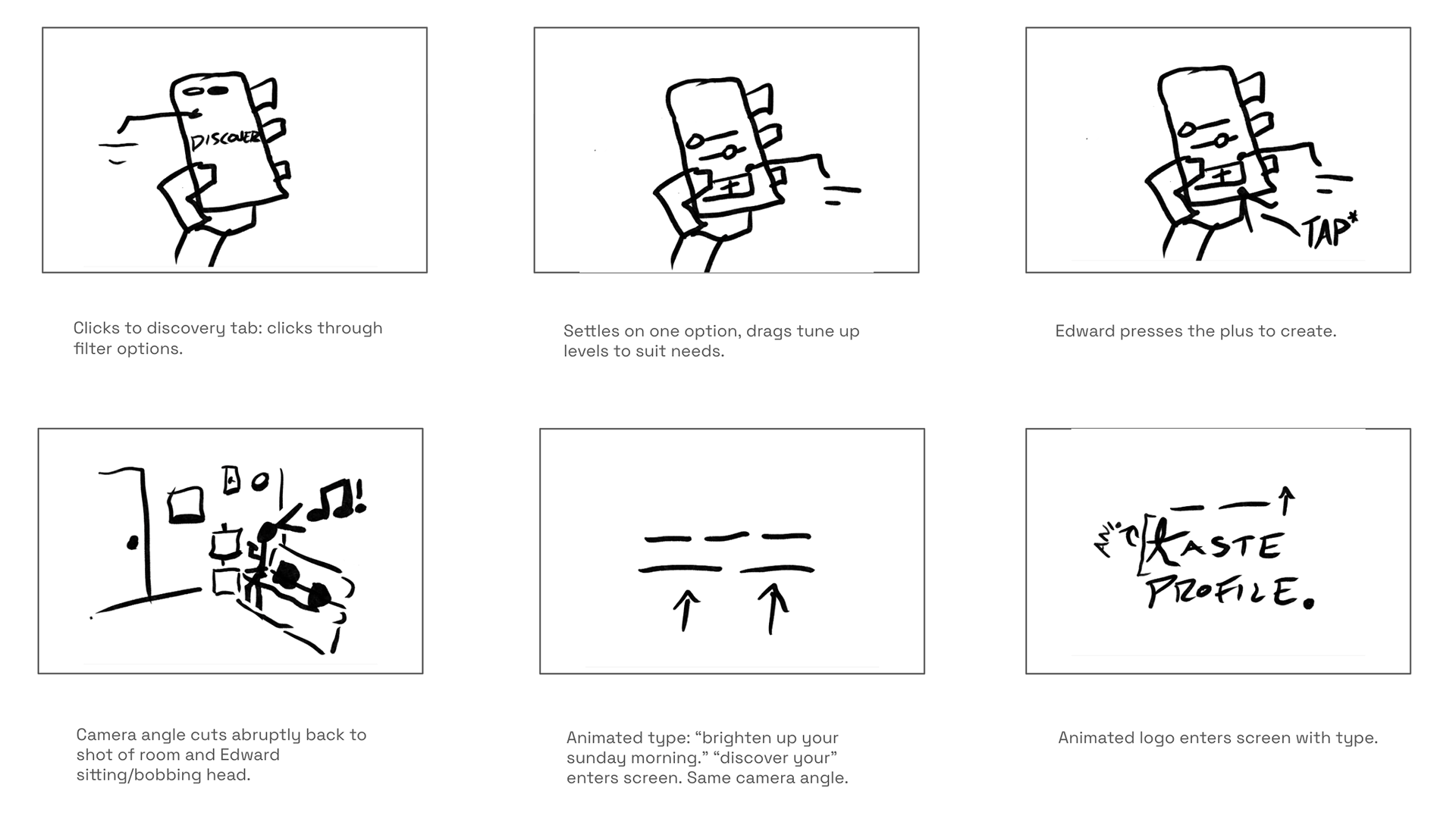
For my advertisement, I wanted to mix the concept of a mood advertisement with a clear problem and solution. Warm cozy sunday, but with a new twist: discovery. My set will be my bedroom, as I spent enough time decorating and making it look warm toned already- which fits the idea of my ad. I created a storyboard and script for the idea, mixing delicate videography with some clean motion graphics at the end.
Discover Your Taste Profile Today.